case study
mobile app
mobile
app


My role
We were a small team of three designers reporting directly to the Head of UX/CPO. I was the designated mobile app designer in our team – for both iOS and Android – so I designed the whole app from start to finish with ongoing development.
We were a small team of three designers reporting directly to the Head of UX/CPO. I was the designated mobile app designer in our team – for both iOS and Android – so I designed the whole app from start to finish with ongoing development.
Phase 1
Phase 1
Merge old apps
Goal
Goal
When I started my role we had two mobile apps, one for booking meeting rooms and one for desks. Adoption was very low as both were quite substandard. My first role was to merge the two into a new app with a singular booking experience.
When I started my role we had two mobile apps, one for booking meeting rooms and one for desks. Adoption was very low as both were quite substandard. My first role was to merge the two into a new app with a singular booking experience.
I did an itinerary of tasks available on both apps, and highlighted all similarities which would easily merge into streamlined flows.
I did an itinerary of tasks available on both apps, and highlighted all similarities which would easily merge into streamlined flows.
Design System: Mobile
I took this opportunity to kick off our design system for mobile apps. I’d already done a fair amount of progress on our desktop design system, so many choices were already set in stone.
I took this opportunity to kick off our design system for mobile apps. I’d already done a fair amount of progress on our desktop design system, so many choices were already set in stone.


Rooms on floor plan
Compromise
Compromise
Desk locations were already available on a floor plan view, but meeting rooms were not. I introduced the ability to add meeting rooms to floor plans on the desktop admin portal, but couldn’t reliably count on them being available for the new app, as it could require a significant amount of data entry from our clients’ admins.
Desk locations were already available on a floor plan view, but meeting rooms were not. I introduced the ability to add meeting rooms to floor plans on the desktop admin portal, but couldn’t reliably count on them being available for the new app, as it could require a significant amount of data entry from our clients’ admins.
I would have preferred for the app to be a floor-plan-centric model, like Google Maps. Instead, I modelled it around a calendar interface with floor plans shown when available for individual bookings.
I would have preferred for the app to be a floor-plan-centric model, like Google Maps. Instead, I modelled it around a calendar interface with floor plans shown when available for individual bookings.
Redesign
Designing core happy-path flows in lo-fi, getting feedback from the design team and PMs, and doing sense checks with Engineering to see how they pair up with existing APIs.
Designing core happy-path flows in lo-fi, getting feedback from the design team and PMs, and doing sense checks with Engineering to see how they pair up with existing APIs.


Sample screens (not a flow)
Converting to hi-fi, collating all use cases, rolling out all flows and ongoing checks with engineering. Pulling out components to continue building up our mobile design system and making sure they're WCAG AA compliant.
Converting to hi-fi, collating all use cases, rolling out all flows and ongoing checks with engineering. Pulling out components to continue building up our mobile design system and making sure they're WCAG AA compliant.


Sample screens (not a flow)
Phase 2
Phase 2
Expand Workspace types, integrate with Outlook
Goal
Goal
Our CPO wanted to move our product solution beyond just meeting rooms and desks, to include any type of office space. For example: soft-spaces, hot desks, phone booths, lockers, parking spaces etc...
Our CPO wanted to move our product solution beyond just meeting rooms and desks, to include any type of office space. For example: soft-spaces, hot desks, phone booths, lockers, parking spaces etc...
I worked on introducing this delineation in the desktop admin portal, allowing admins to create any work workspace type and assign booking rules to them, which would then feed that data into our mobile app.
I worked on introducing this delineation in the desktop admin portal, allowing admins to create any work workspace type and assign booking rules to them, which would then feed that data into our mobile app.
In the meantime, engineering was working on MS365 integration, syncing our bookings calendars with users' Outlook calendars. I was designing our Outlook Add-in during that time (see more about it here), so I made sure the mobile app worked neatly within that wider ecosystem.
In the meantime, engineering was working on MS365 integration, syncing our bookings calendars with users' Outlook calendars. I was designing our Outlook Add-in during that time (see more about it here), so I made sure the mobile app worked neatly within that wider ecosystem.


Phase 3
Phase 3
Facilitate Collaboration for Flexible working
Goal
Goal
To facilitate collaboration in emergence of flexible working, I added features to surface the office presence of colleagues, when they'll be in and where they're located in the office. We received a top-level vision deck from the CPO, but every detail was up for debate and open to suggestions.
To facilitate collaboration in emergence of flexible working, I added features to surface the office presence of colleagues, when they'll be in and where they're located in the office. We received a top-level vision deck from the CPO, but every detail was up for debate and open to suggestions.
Defining the problem space
Challenge
Challenge
It’s very difficult to do contextual research on such a global problem, particularly while flexible working was still in debate at the time. The scope needed to get reliable results was far beyond what our small team could do, so we did the best with what we could get.
It’s very difficult to do contextual research on such a global problem, particularly while flexible working was still in debate at the time. The scope needed to get reliable results was far beyond what our small team could do, so we did the best with what we could get.
What we could do
What we could do
Client conversations by the CPO.
Client conversations by the CPO.
6 Client interviews held by a team mate and me.
6 Client interviews held by a team mate and me.
Insight from our Director of Customer Advocacy.
Insight from our Director of Customer Advocacy.
References from a third-party research agency, Leesman Reviews.
References from a third-party research agency, Leesman Reviews.
Pain Points, who/when/where
Some of the most common pain points employees had – that we could address with our product solution – is not knowing who else will be in the office, when they'll be in, and where they'll be.
Some of the most common pain points employees had – that we could address with our product solution – is not knowing who else will be in the office, when they'll be in, and where they'll be.
New features to add
Today
Today
Manage your office presence
Manage your office presence
Create your own team
Create your own team
See who's in
See who's in
Book near colleague
Book near colleague
Create a team day
Create a team day
Redesign
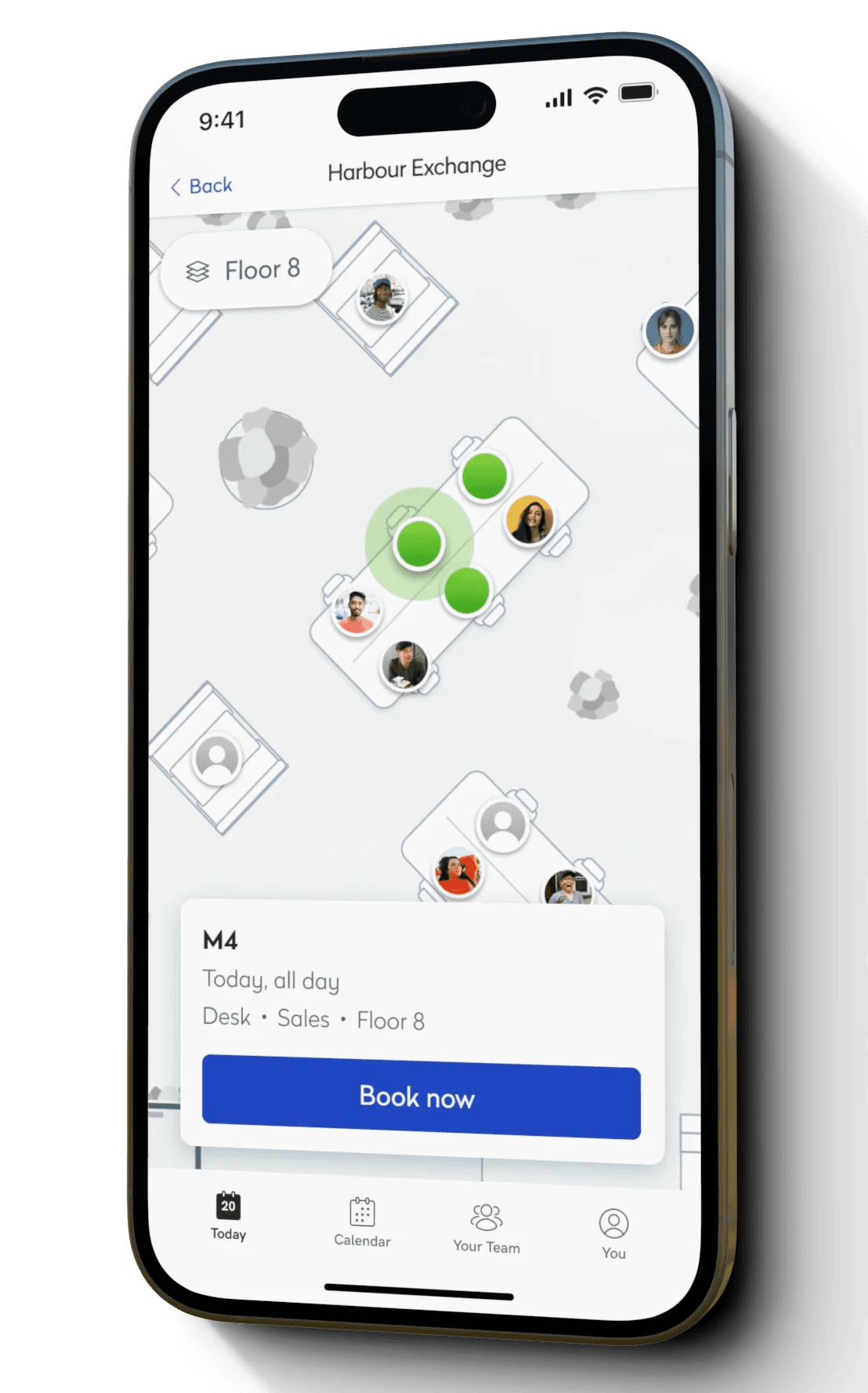
I introduced a Today screen as the new home. This is where user's can manage any immediate need relating to their office presence, see who else is in today, and handle their bookings for the day.
I introduced a Today screen as the new home. This is where user's can manage any immediate need relating to their office presence, see who else is in today, and handle their bookings for the day.
We also introduced a Your Team section where users can collate a list of colleagues they're collaborating frequently with at the moment. These are the colleagues who's presence will appear in Today and Calendar.
We also introduced a Your Team section where users can collate a list of colleagues they're collaborating frequently with at the moment. These are the colleagues who's presence will appear in Today and Calendar.
While the user's decision making has shifted to when to be in the office – based on who else is around – we've had to rethink how our booking flows start. Rather than start from a New Booking link in the global nav, we moved it into the calendar views. Now Today and Calendar are the places to make decisions and start booking.
While the user's decision making has shifted to when to be in the office – based on who else is around – we've had to rethink how our booking flows start. Rather than start from a New Booking link in the global nav, we moved it into the calendar views. Now Today and Calendar are the places to make decisions and start booking.


Sample screens (not a flow)
Your Team placement
Compromise
Compromise
Your Team – your list of frequent collaborators – was placed as a new item in the global nav. As the people you collaborate with changes over time, this become a list that needs to be updated frequently, and makes the user have to bounce back & forth between it and Today/Calendar.
Your Team – your list of frequent collaborators – was placed as a new item in the global nav. As the people you collaborate with changes over time, this become a list that needs to be updated frequently, and makes the user have to bounce back & forth between it and Today/Calendar.
My ideal drafts saw Your Team exist as a filter in Today & Calendar, but this was deemed out of scope by engineering. So it was placed as a top-level nav item as an interim solution.
My ideal drafts saw Your Team exist as a filter in Today & Calendar, but this was deemed out of scope by engineering. So it was placed as a top-level nav item as an interim solution.
Usability Testing
We conducted a series of moderated and unmoderated tests with 21 respondents, some of which were existing customers and some were newcomers. Moderated tests were done via MS Teams and unmoderated tests were done with prototypes set up on Maze, followed by questionnaires.
We conducted a series of moderated and unmoderated tests with 21 respondents, some of which were existing customers and some were newcomers. Moderated tests were done via MS Teams and unmoderated tests were done with prototypes set up on Maze, followed by questionnaires.
We used the System Usability Scale to measure how user-friendly our new solutions are, and whether they're considered "likely to be used". After two rounds of testing, we got our SUS score up to 89 which equates to a grade of A+.
We used the System Usability Scale to measure how user-friendly our new solutions are, and whether they're considered "likely to be used". After two rounds of testing, we got our SUS score up to 89 which equates to a grade of A+.


Sample visuals of final report
Related Works

Workplace booking, space management.
Case studies
Deeper dives into product developments.
© Richard Gouw 2024


